Why we built OutThere in the open
The story behind the launch — from the first dirty Figma to the loudest landing page we could imagine.
Creator economy · Light Mode · v2
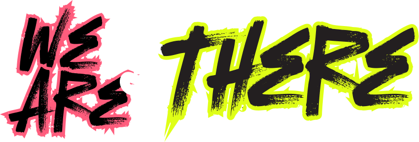
Stream. Link. Repeat. The light-mode translation keeps the brand's gig-poster voice — the real Bulevar face, the source's 0.75 line-height, and a single outlined word as the rhythm beat.
v2 · Hero slider headlines
All seven source slider headlines, with the per-word outline pattern. Specs locked to the live source: Bulevar Webfont · weight 400 · 234px / 175.5px (0.75 ratio) · letter-spacing normal · uppercase · 2px stroke on outlined words. Slides 3, 5, 7 use two-word phrases; the rest use a single word. Hover any outlined word to see it fill with the lime accent (#DFF352) — 200ms ease-out fade across fill, stroke, and color.
Identity · official mark
The OutThere logo is a two-colour SVG. The tag glyph uses --accent (lime); the wordmark + decoration use --text (warm white). Source is at ./v2/assets/weareoutthere-logo.png · viewBox 480×203 · aspect ratio ≈ 2.36 : 1.
#DFFF17 (a brighter neon-yellow lime).
The current system uses #DFF352 (= oklch(92% .18 116), sourced from the lovable reference) as the canonical --accent.
These are sibling lime tokens with the same hue range but ~2pt different lightness.
The SVG declares fill: var(--accent, #DFF352), so the logo inherits whichever value you bind to --accent.
To go back to the original brighter neon-yellow, override the variable in the host page:
:root { --accent: #DFFF17; }
Palette · canonical tokens
Brand fills always pair with text-inverse, never white.
Type · Bulevar + Roboto Flex
Display is the real Bulevar Webfont at weight 400 (it ships at one weight only). Body is Roboto Flex; app/UI titles are Plus Jakarta Sans. Letter-spacing is normal on display, +0.02 to +0.06em uppercase on labels.
Geometry · spacing & radius
Two-radius doctrine: brand rooms are sharp (zero radius); interactive controls are maximally round (64px pill). The lg / md / sm rungs are reserved for non-brand surfaces like cards, FAQs, and tooltips.
2xs
2px
xs
4px
sm
8px
md
16px
lg
24px
xl
32px
2xl
48px
3xl
64px
4xl
96px
section-y
96px (desktop)
none
0px · brand rooms
sm
8px · FAQ / tooltip
md
12px · alerts / small surfaces
lg
16px · cards / modals
pill
64px · buttons / inputs
full
9999px · avatars
v2 Stroke on a coloured room
Outlined words on a brand room flip stroke colour to text-inverse. Same 2px width.
No throttle. No paywall. No filter you didn't set yourself.
Brand band · soft pink
The contour treatment keeps the brand voice loud without saturating the eye. One word is the beat.
More Options— Amaya R., touring chef & creator
Category cards
Single-fill, hard-edge, ink-dark text. Never apply shadow or border. The colour edge is the boundary.
Controls · pills + tags + signals
Every interactive control is a pill. Primary on dark = light fill, ink label. Hover flips to hot pink. Lime is the system accent — reserve it for highlights and one-of-a-kind CTAs.
Your OutThere URL is on the clipboard.
One more step to publish your profile.
We couldn't process this card. Try another.
Discover creators
Cards sit on surface-raised, never tinted by accent colour.
Chronicles · editorial
Image at top, 16:10 ratio. Category tag is the lime --accent chip — the one place we let lime touch a dark card.
The story behind the launch — from the first dirty Figma to the loudest landing page we could imagine.
Stop hiding your best content under a generic grid. A practical guide for creators who actually ship.
How we kept the saturation of a gig-poster site while moving the whole stage down to near-black.
Product · app surfaces
When you cross from marketing to the app, density doubles. Type drops to Plus Jakarta Sans titles + Roboto Flex body. Buttons keep their pills. Numbers use tabular numerals.
Profile views
42,318
↑ 12.4% vs prevLink clicks
9,471
↑ 6.1% vs prevAvg. CTR
22.4%
↓ 0.8% vs prevForms · surfaces · focus
Single-line inputs are full-pill (64px). Focus ring is hot pink at 4px translucent. Textareas drop to --r-lg (16px) — a pill would be wrong on a multi-line field.
This will permanently remove "Spring recipe drop" from your profile and clear its analytics. There's no undo.
Focus state demo
Focus uses --focus ring at 4px translucent. Same colour as --primary.
Tooltip / popover
FAQ band · current
v2 New Pattern · FAQ proposal
The current "Small print" FAQ on home, profile, and link pages reads as generic dark-card UI — it doesn't carry any of the v2 brand voice (Bulevar display, hairline-and-flat-colour depth, two-radius doctrine, per-word outline mechanic). Below are three on-brand alternatives. Pick one and we'll port it through every page.
Option A · Index
Editorial poster / newsprint layout. No card chrome — hairlines do the work. Numbered rows, Bulevar question, thin + glyph. Open state lifts the hairlines + numeral to lime.
Anyone earning, or paying, creators directly. We're vouch-first, so knocks attached to an existing member move faster — but cold knocks are read, every one.
Every connected platform reports gross earnings to OutThere monthly. We attribute, calculate 5% of attributable revenue, and pay on the 15th of the following month — bank transfer, no held funds.
If a creator earns on it and we can read the rev report, it counts. Currently: OnlyFans, Patreon, Substack, YouTube, Twitch, Whop, Beacons, Stan, and any custom Stripe-billed page.
No cliff, no expiry. The 5% stands as long as the creator is on the platform you referred them to. Clawback only applies to chargebacks > £500 in the first 60 days.
Anyone earning, or paying, creators directly. We're vouch-first, so knocks attached to an existing member move faster — but cold knocks are read, every one.
Every connected platform reports gross earnings monthly. We attribute, calculate 5% of attributable revenue, and pay on the 15th.
If a creator earns on it and we can read the rev report, it counts. OnlyFans, Patreon, Substack, YouTube, Twitch, Whop, Beacons, Stan, and any custom Stripe page.
No cliff, no expiry. Clawback only applies to chargebacks > £500 in the first 60 days.
Option B · Stripe
Sharp-cornered tinted rows (brand-room doctrine). Numbered column on the left, mono. Open row becomes a full lime "room" with ink text — carries the same hover doctrine as the band sections.
Option C · Headline
Most on-brand. Each question is a full-bleed Bulevar headline using the per-word outline mechanic. Hover / open fills the outlined word lime — the same beat used on the hero, link pills, and stat eyebrows.
Anyone earning, or paying, creators directly. We're vouch-first, so knocks attached to an existing member move faster — but cold knocks are read, every one.
Every connected platform reports gross earnings to OutThere monthly. We attribute, calculate 5% of attributable revenue, and pay on the 15th of the following month — bank transfer, no held funds.
If a creator earns on it and we can read the rev report, it counts. OnlyFans, Patreon, Substack, YouTube, Twitch, Whop, Beacons, Stan, and any custom Stripe-billed page.
No cliff, no expiry. The 5% stands as long as the creator is on the platform you referred them to. Clawback only applies to chargebacks > £500 in the first 60 days.
| Option | Voice | Density | Brand fit |
|---|---|---|---|
| A · Index | Editorial | Medium | ★★★★☆ |
| B · Stripe | UI / utility | High | ★★★★☆ |
| C · Headline | Poster | Low | ★★★★★ |
C · Headline carries the most v2 brand voice — it reuses the per-word outline mechanic that already runs the hero, link pills, and stat eyebrows. A · Index is the safest mid-density alternative if Bulevar at headline scale per row is too loud. B · Stripe works best on dense FAQ pages (10+ items) where you want a "settings list" feel.
All three use native <details>
markup — no JS required. Toggle the demos to verify behaviour.
Once you pick, we'll port through home / profile / light / bg variants.
v2 New Pattern · Animated
Solari / airport-style flap cards for live or one-shot numbers. Two scales share one keyframe — `rotateX(0 → -90deg)` with `transform-origin: bottom center` over 420ms, fading out in the last 20%.
Same Solari card chrome as the large countdown — scaled down to 30 × 44, digit 46px / line 44. Hydrated from .stat-flaps[data-value]; cascades in from 0 to its target with a 70 ms stagger.
✓ Live countdowns (hero, presale, launch banners).
✓ Stats on profile / member pages — first-time arrival flourish.
✓ Anything mechanical: money tracked, votes counted, room capacity.
✗ Pure body copy — Bulevar at small sizes already provides display energy.
✗ Inputs / form fields — flaps imply read-only.
✗ More than one large-scale ticker per page (small-scale strips can repeat).
Markup — each card carries a static top + bottom half and an animating top-flap leaf.
<span class="flap-lg" data-d="9">
  <span class="half top"><span>9</span></span>
  <span class="half bottom"><span>9</span></span>
  <span class="flap-leaf"><span>9</span></span>
</span>
Small-scale hydration — render flaps from a string.
<span class="stat-flaps" data-value="£820k"></span>
v2 New Pattern · Composition
Linktree-style profile pattern built on existing tokens. Reuses the
hug-centre hero treatment, lime verified chip, ticker-driven stats,
pill-row link list, and ghost-chip tip row. See
profile-rebecca-crow.html for the full page.
Member 001 · Founder · London, UK Verified
Founder of OutThere. Every link runs on the 5% mechanic — paid, attributed, settled on the first Monday of each month.
Colour-coded circular icons signal platform family using existing v2 tokens.
| Variant | Token | Meaning |
|---|---|---|
.brand-accent | --accent | Pinned / featured |
.brand-pink | --primary | YouTube, Twitch |
.brand-cyan | --accent-cyan | TikTok, video |
.brand-orange | --accent-orange | Substack, mail |
.brand-magenta | --accent-pink | Instagram, image-social |
.brand-soft | --accent-soft-pink | OnlyFans, paid-creator |
| (default) | --surface-strong | Utility (booking, contact) |
Keeps a cut-out portrait flush with the wrap's right edge on wide viewports; flush-right on narrow ones.
background-position:
  right max(0px, calc(50% - 640px)) center;
v2 New Pattern · Hero image
Two hero treatments. Hug-centre (§3) keeps a cut-out portrait flush with
the centred content edge and uses a single asymmetric wash. Full-bleed pinned (§4)
fills the band with the un-cropped photo, pins it to the viewport with
background-attachment: fixed,
and stacks two overlays for legibility. Either variant flips to a pink edition
with a five-line token swap.
§3 · Lime · hug-centre
home.html · hero-bg-2-cutout.png · single left wash
§3 · Pink · hug-centre
home-pink.html · token swap · same layout
§4 · Lime · full-bleed pinned
home-bg.html · hero-bg-2.png · cover + fixed · 2 overlays
§4 · Pink · full-bleed pinned
home-bg-pink.html · pink + parallax
Four shipped variants. The accent swap is orthogonal to the hero treatment.
| File | Treatment | Accent |
|---|---|---|
home.html | Hug-centre cut-out (§3) | #DFF352 |
home-pink.html | Hug-centre cut-out (§3) | #FF5D7D |
home-bg.html | Full-bleed pinned (§4) | #DFF352 |
home-bg-pink.html | Full-bleed pinned (§4) | #FF5D7D |
| Variant | Image | Sizing |
|---|---|---|
| §3 hug-centre | hero-bg-2-cutout.png | auto 100% |
| §4 full-bleed | hero-bg-2.png | cover |
Five lines, no structural changes. Works for either hero treatment and for the profile / Linktree composition.
:root {
  --accent: #FF5D7D;   /* was #DFF352 */
  --neon:   #FF5D7D;   /* alias */
}
.btn-accent:hover {
  background: #FF7A93; /* was #EAFF4F */
}
.flap .half span,
.flap .flap-leaf span {
  text-shadow:
    0 0 18px rgba(255,93,125,0.26);
  /* was rgba(255,93,125, 0.20); alpha bumped */
}
Caveat: the PNG brushstroke logo bakes the lime into the artwork and is
not token-reactive. The SVG sibling (assets/logo.svg) would
re-colour automatically if swapped in.
1 · Drop glow-hero
from the hero <section>. Its
::before injects
height: 720px and
opacity: 0.22 onto the same
pseudo-element we use for the flat dim, silently clipping it.
2 · Under background-attachment: fixed,
cover sizes the image to the
viewport not the hero. Framing shifts a touch on tall windows.
3 · iOS Safari fallback to
scroll is automatic and
acceptable. The effect degrades gracefully.
4 · Don't put a transform,
filter, or
will-change: transform
on any ancestor of the hero — that creates a new containing block and breaks the
viewport-anchored attachment.
.hero {
  background-image: url('/assets/hero-bg-2.png');
  background-size: cover;
  background-position: right center;
  background-attachment: fixed;
  overflow: hidden;
}
.hero::before {
  content: ""; position: absolute; inset: 0;
  background: rgba(251,245,229, 0.66);   /* flat dim */
  z-index: 0;
}
.hero::after {
  content: ""; position: absolute; inset: 0;
  background: linear-gradient(90deg,
    rgba(251,245,229, 0.78) 0%,
    rgba(251,245,229, 0.55) 35%,
    rgba(251,245,229, 0.18) 65%,
    rgba(251,245,229, 0)    100%);
  z-index: 0;
}
.hero > * { position: relative; z-index: 1; }
Guardrails · v2 deltas in bold
The doctrine that keeps the brand legible. Bolded items are the load-bearing rules — break them last.
./fonts/bulevar-regular-webfont.woff2..heading_outline.Tokens · Tailwind / CSS
Paste-ready cheatsheet for downstream agents. Every token here is sourced verbatim from DESIGN.md. Lime is `#DFF352` (lovable-aligned). Override --accent once to swing the whole system (including the logo's tag glyph).
| Component | Background | Text | Radius | Padding |
|---|---|---|---|---|
| button-primary | text (#F4F1EA) | text-inverse | pill (64px) | 20px 32px |
| button-secondary | transparent + text border | text | pill | 18px 30px |
| input-default | surface | text | pill | 14px 20px |
| textarea | surface | text | lg (16px) | 14px 18px |
| card-default | surface-raised | text | lg | 24px |
| category-card | accent-* | text-inverse | none (0) | 24px |
| article-card | surface-raised | text | lg | 0 0 24px 0 |
| feature-band-lime | accent (#DFF352) | text-inverse | none | 96px 32px |
| faq-row | accent-pink | text-inverse | sm (8px) | 20px 24px |
| modal-surface | surface-raised | text | lg | 28px |
| alert | surface-raised + stripe | text | md (12px) | 16px 20px |
| footer | surface-ink (#231F20) | text | none | 64px 32px |